Logo and brand idea
Overview
Our logo and brand idea are central to how Kyndryl is recognized, perceived and differentiated globally. Both are legally protected assets and must be used correctly and consistently — not only to strengthen our brand, but to safeguard it. The guidance below defines the approved use of our logo and brand idea.
About our logo
- Our logo conveys vibrant energy, human warmth and a passionate outlook for progress through color and form.
- The strong, crisp letters precisely balance edgy angles with softer curves. The staggered angles assert bold, forward motion and flexible structures that coordinate together.
- The gentle curves in the “n,” “d,” and “r” intentionally evoke the empathetic humanity at our core.
- The simplicity and lightness of the logo ensure clarity and allow our name to resonate.
Basic usage guidance
Our Kyndryl logo is a custom wordmark — our company name designed with unique spacing, weight and detail. While typing "Kyndryl" in TWK Everett font may look similar, it isn't the same as our official, registered logo. Typing out or altering the logo in any way can confuse customers who are still getting to know us and may create legal risk, which is why it's important to always use the correct logo file and get brand and legal approval prior to use.
While the registered logo begins with a lowercase “k,” our company name should always be typed with an uppercase "K" in copy (for example, “the Kyndryl brand”).
The Kyndryl logo is registered worldwide and the registered trademark symbol (®) must appear with the logo at all times. Use of the ® symbol formally asserts Kyndryl’s legal rights and places others on notice of our ownership. Correct and consistent application is required to protect and enforce our trademarks.

Logo color
Below is detailed design guidance on how to use the registered Kyndryl logo correctly and consistently across use cases and content types. Any and all use of the Kyndryl logo requires brand and legal approval prior to use.

Logo colors
Our logo color combinations were carefully chosen to create a distinct brand palette that is ADA compliant. To the left are our approved logo color combinations.
Main color versions
Our logo comes in two main versions: color (positive) and white (negative).

Primary color logo (positive)
When our logo is placed on light backgrounds, we use the positive version in Warm Red. This is our primary logo.

Secondary white logo (negative)
When our logo is placed on a Warm Red or darker background, we use the negative logo in white.
Backgrounds
Background contrast directly impacts logo legibility. In addition to the primary color versions shown above, a limited set of approved logo color combinations is available to ensure clarity across different applications. The Kyndryl logo must always be placed on solid, unobstructed backgrounds that provide sufficient contrast. Textured, patterned, or visually complex backgrounds are not permitted, as they compromise readability and weaken brand integrity. Explore our tertiary logo color combinations below.

Warm Red logo on Cloud background

Warm Red logo on Skye background

White logo on Spruce background

White logo on Dark Stone background

White logo on Earth background

Deep Forest logo on Spring Green background
Note
Always choose the logo version that creates the strongest contrast, and avoid placing the logo on photography. Use the black logo only when required for production (like grayscale or newspaper printing) or for ADA compliance. Never use the black logo on a Warm Red background.
Logo on materials
When placing our logo on physical materials, we always pair the logo with a material background that creates the strongest contrast. For full environmental guidance, visit our Environments page.
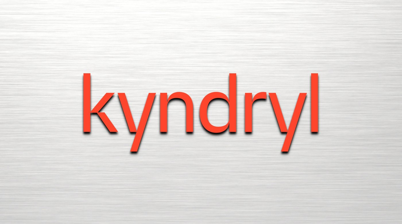
Steel
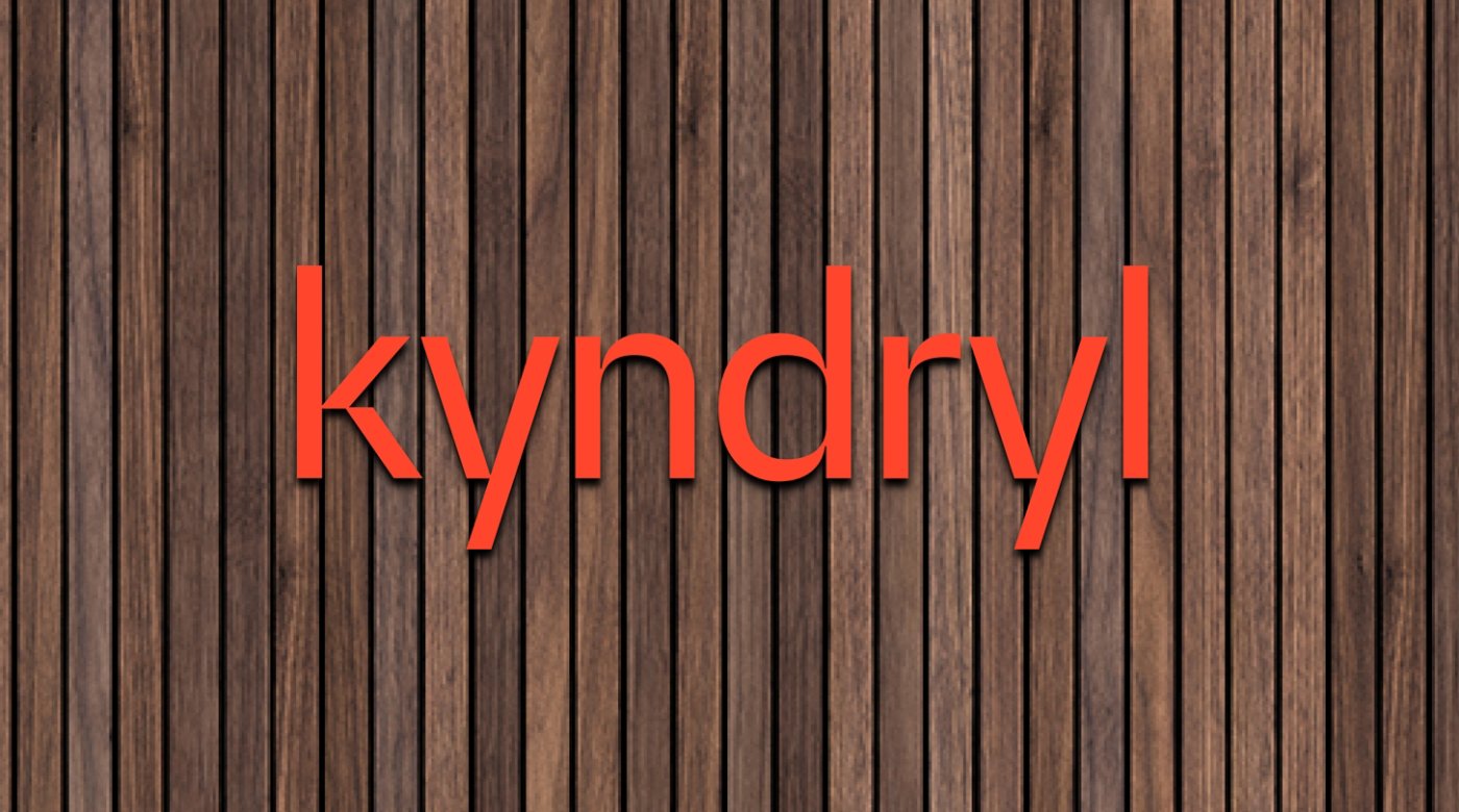
Wood

Concrete
Logo spacing and minimum size
A little breathing room goes a long way — proper sizing and clear space helps our logo stay readable and distinct.

Logo spacing and minimum size
Always leave clear space around the logo at least equal to the height of the “n” in the logo (about half the logo’s height), and more space when you can. Clear space starts at the baseline of the letters, the tops of the ascenders, and the right edge of the “l” (not after the ®).

Minimum size:
For legibility, the logo should be at least 0.75 inches wide in print and 50 pixels wide digitally. On screens, keep pixel density in mind and scale the logo large enough that every letter is easy to read.
Logo placement
Below you can find clear guidance on where to place our logo depending on content type. Always place our logo on a solid background or image where it has clear legibility.
The lower left corner is the preferred placement for the logo in print and for social tiles. For web, the upper left is preferred.


Bottom left
Our logo works best in the bottom left of a layout, which is our primary placement for most branded assets.

Upper left
When the top of the content is easier to access (such as on a letterhead or website), it's okay to place our logo in the upper left of the layout.

Upper right
If a Vital K is used, the logo may be placed in the upper right to ensure it has enough clear space around it (see our visual elements page for in-depth Vital K guidance).

Lower right
Placement in the lower right or center should be reserved for rare cases, such as making a high-impact statement or when no other option works.
Logo misuse
Using our logo consistently helps keep our Kyndryl brand recognizable and distinct. Avoid the following uses.
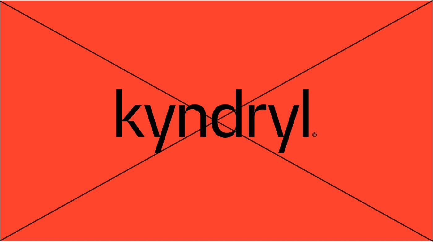
Do not use the black version of the logo on a Warm Red background.
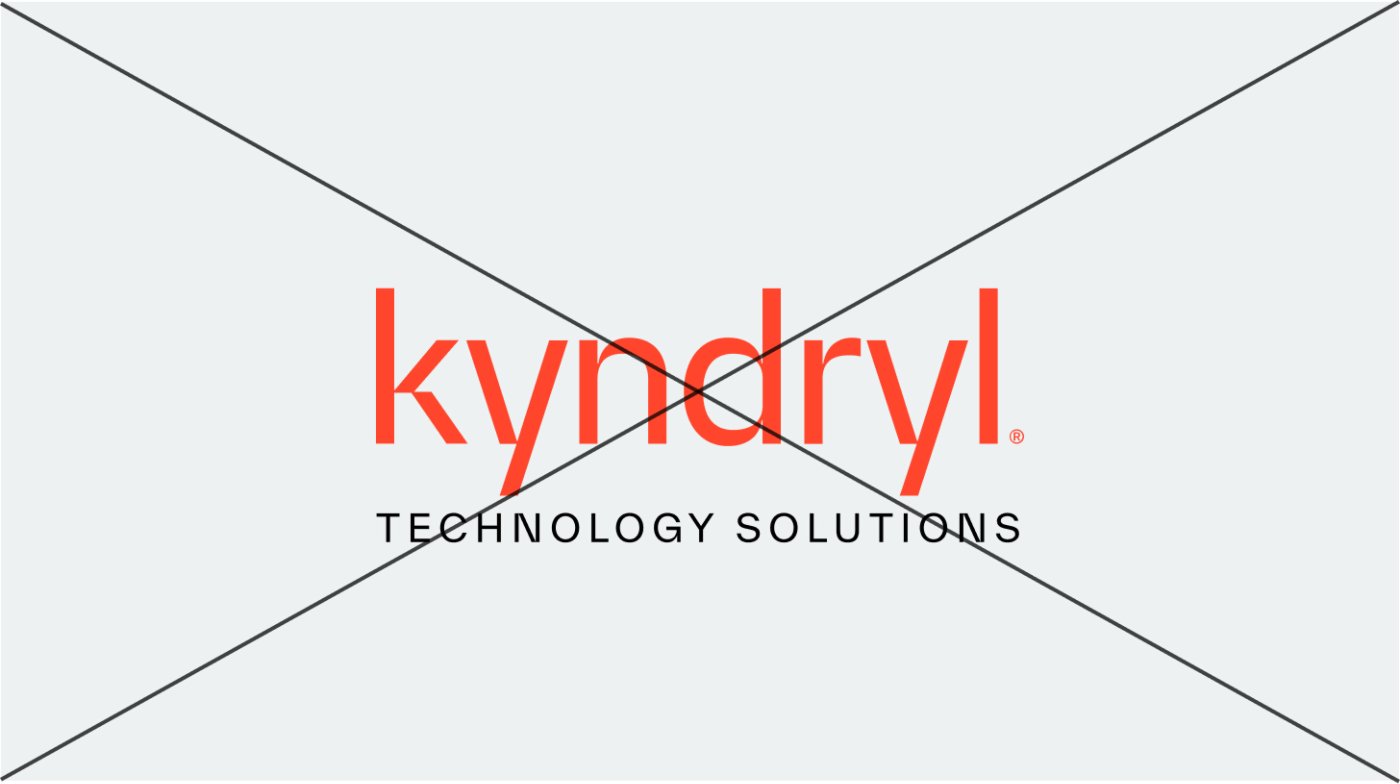
Do not create new lockups or use our logo with unapproved partners or items.
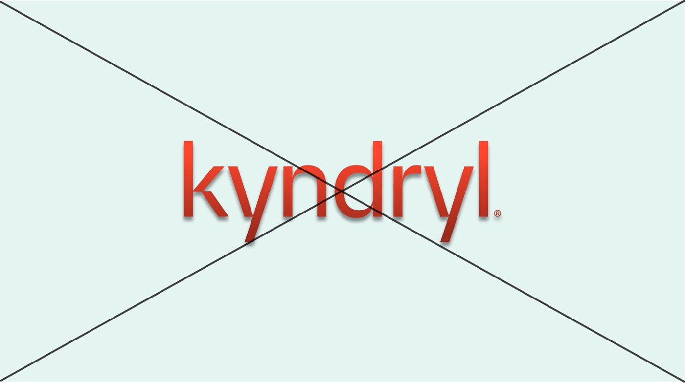
Do not add special effects to the logo, such as drop shadows or bevels.
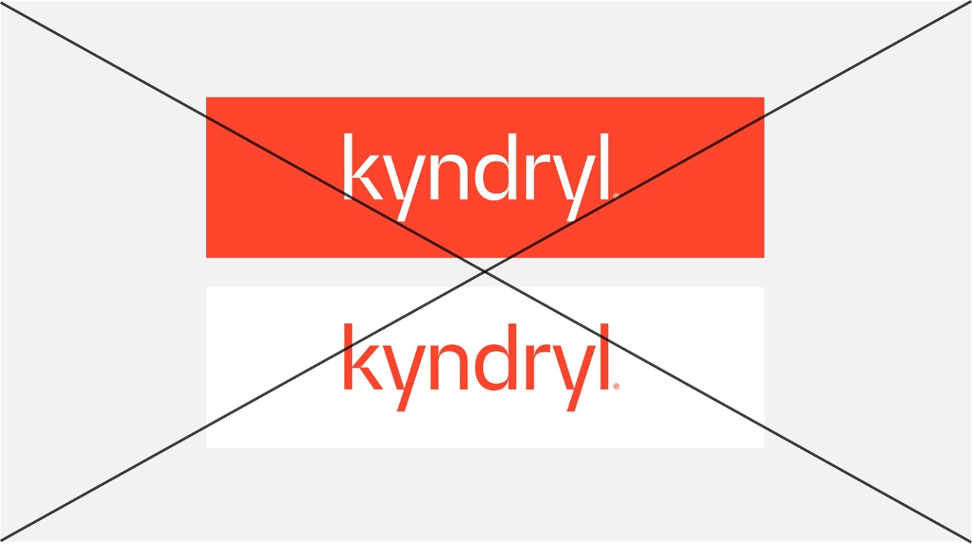
Do not create boxes around the logo.
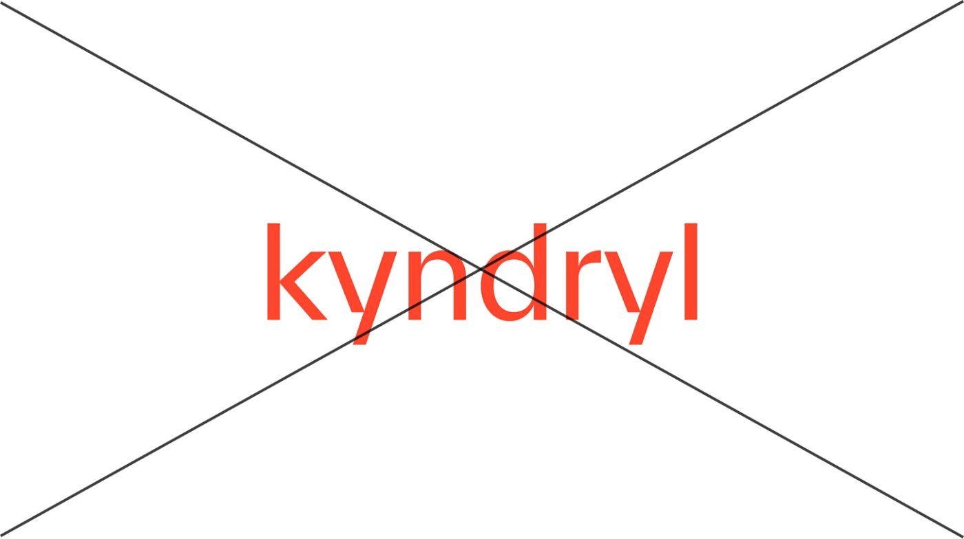
Never type the logo in TWK Everett; always use the official Kyndryl logo art file.
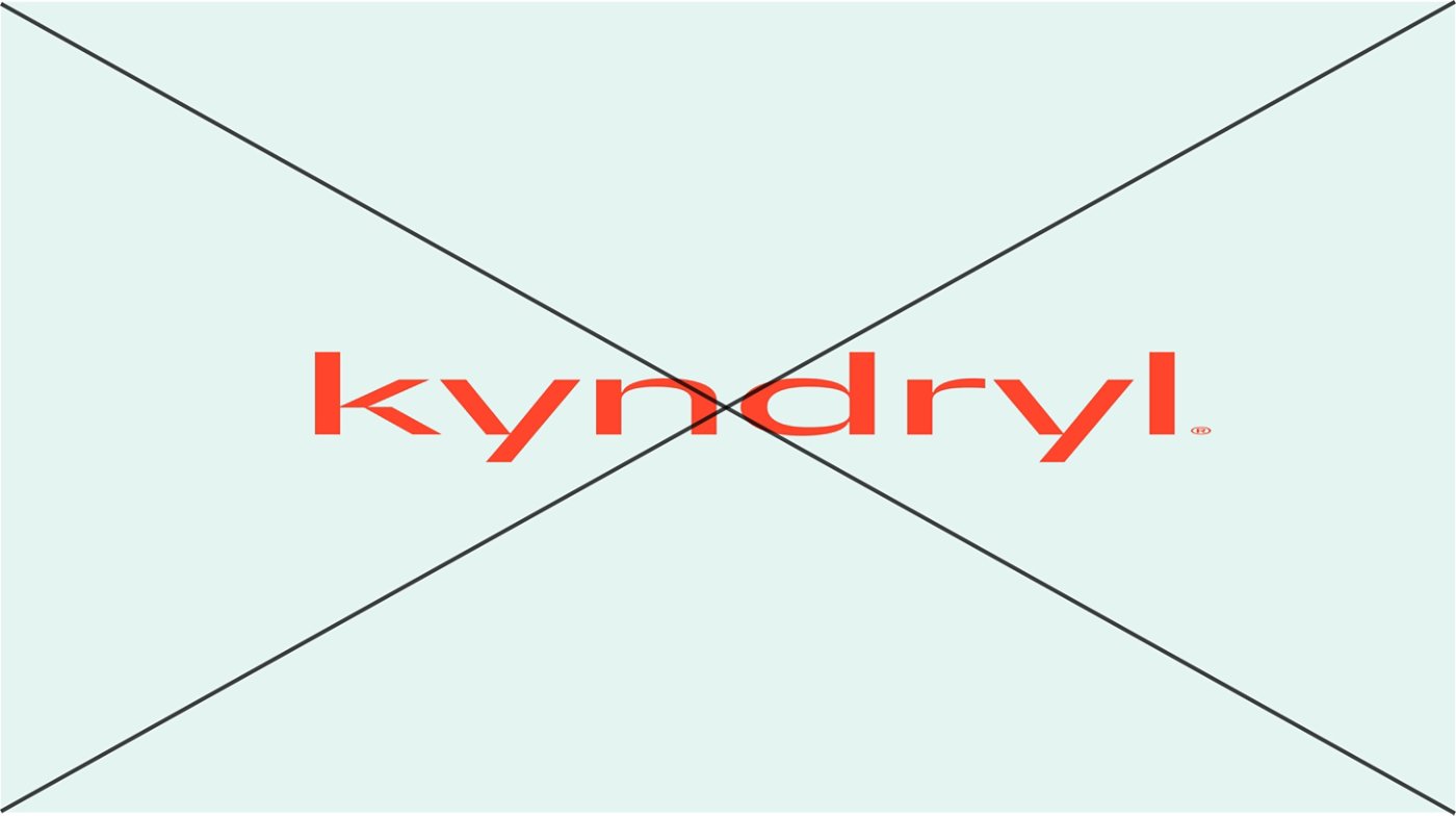
Do not distort the proportions of our logo.
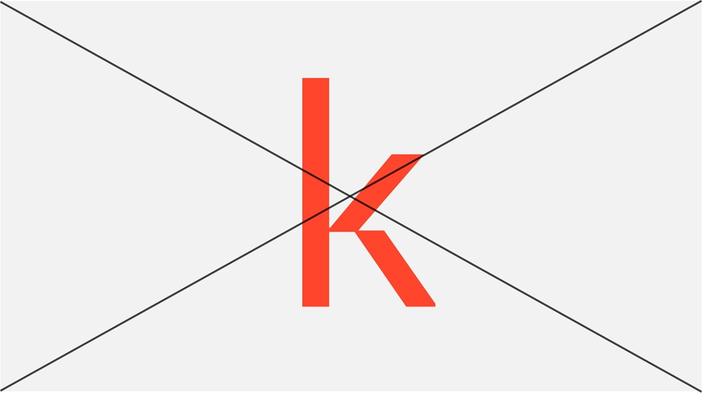
Do not use the “k” in isolation from the rest of the logo.
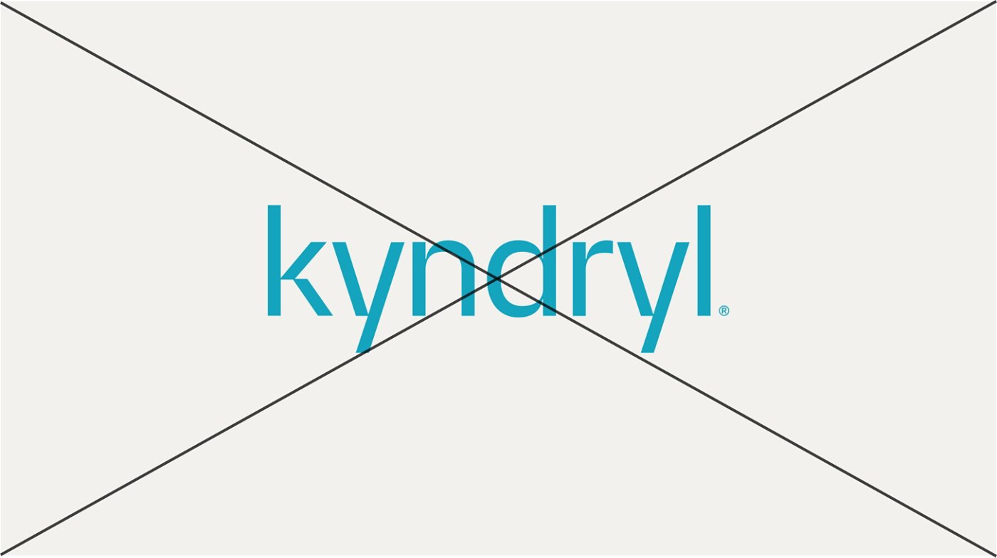
Do not recolor the logo.
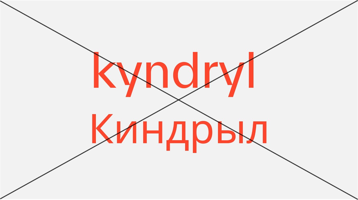
Never transliterate the logo without prior approval; always use the official logo art file.
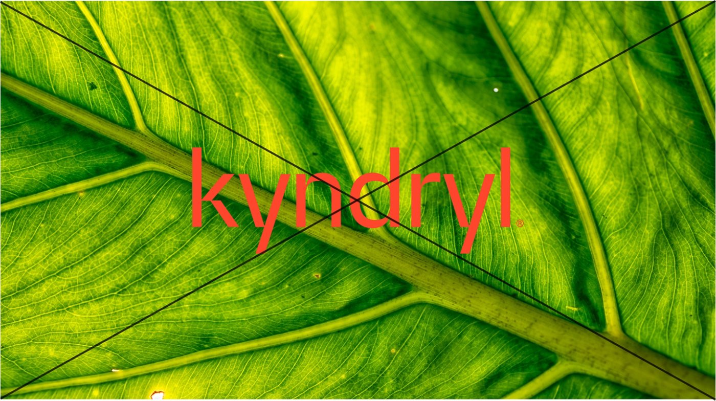
Do not place the logo on photography.
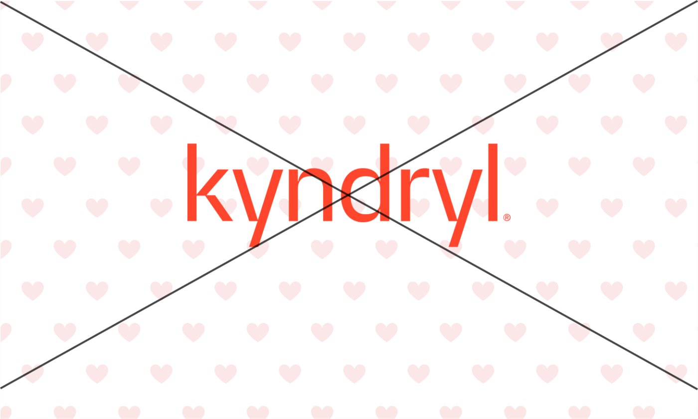
Do not place the logo on patterned backgrounds.
Brand idea: The Heart of Progress™
Our brand idea, The Heart of Progress™, is the core message that forms our brand bedrock. It represents what we want to be known for across audiences and the markets that we serve.

Correct trademark usage
Our brand idea has two approved, trademarked uses.
When used on its own as a headline or tagline, it does not require a period — this is our preferred use. When appearing alongside the typeset Kyndryl name in text, an alternate version may be used, which includes a period after both Kyndryl and the brand idea.
In all cases, the T, H, and P are always capitalized.

We have a service mark
on this phrase globally.

Additional guidance

Our brand idea should always be used as a standalone, separate element. While the brand idea can be used in text alongside the typeset Kyndryl name (as shown in the alternate treatment above), it should never be locked up with the Kyndryl logo.

To ensure that the trademark symbol is legible and accessible, our brand idea should always be set at a minimum at 18 pixels in a Regular weight or 4 pixels in a Bold weight.

Our brand idea should always include the trademark symbol unless it is being featured on merchandise, within narrative copy (ex: “We are the heart of progress for 75 of the Fortune 500”) or in a social media hashtag (“#TheHeartofProgress”).
Brand idea misuse

Do not use parts of the brand idea; always use the full trademarked phrase, including “The.”

Do not abbreviate the brand idea.

Do not outline our brand idea; always use the approved file.

Do not create lockups of the brand idea alongside our Kyndryl logo.

Do not abbreviate the brand idea in social media hashtags.
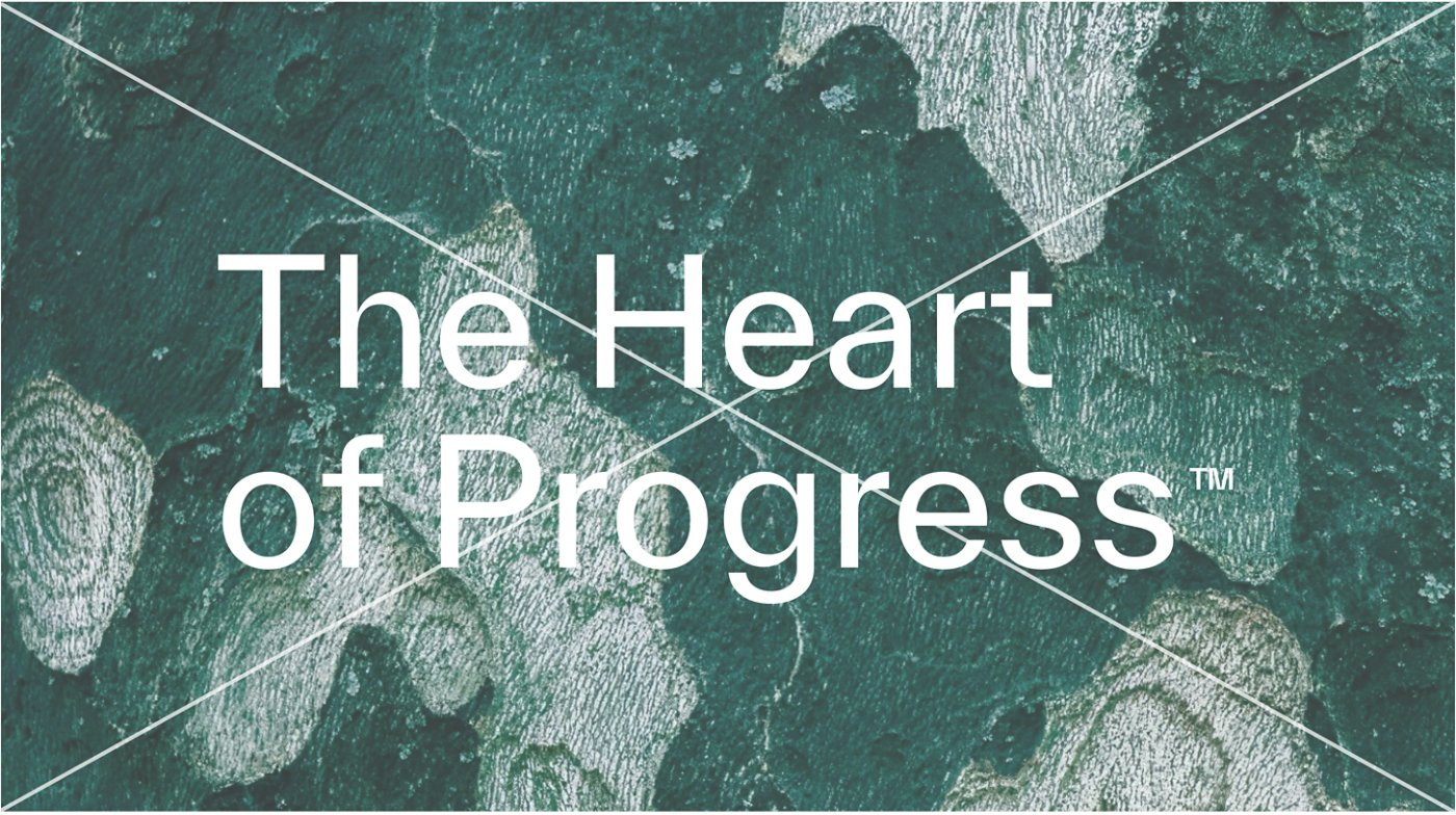
Do not place the "brand idea" text on a photograph or on textured or patterned backgrounds. Textured surfaces are permitted only when the logo is applied to approved physical materials.