Color
Overview
Color is a core expression of the Kyndryl brand, bringing our warmth, energy, and passion to life. Our dynamic palette is intentionally designed to balance boldness, optimism and empathy, while remaining flexible enough to support a broad range of design needs.
For designers
Get the color swatches for Adobe applications.
Color palette
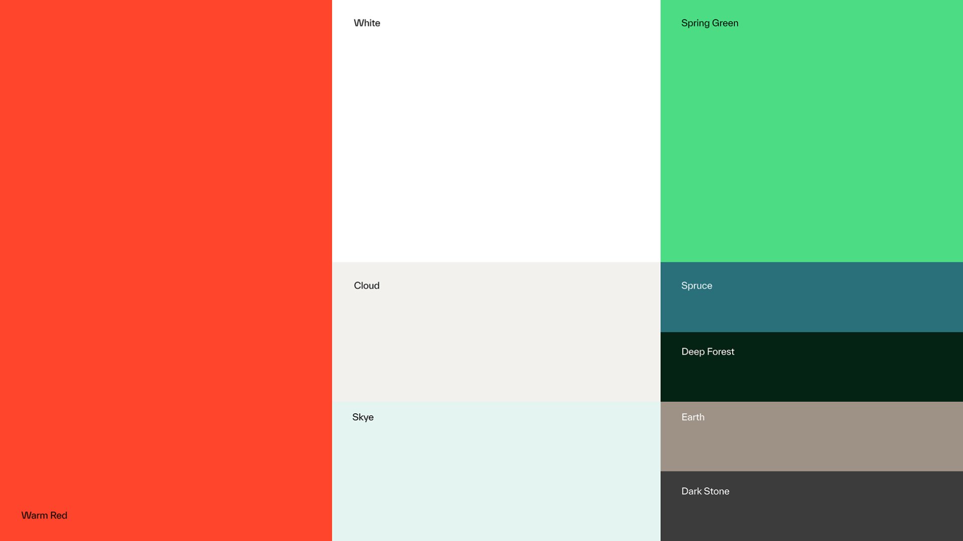
Our primary color palette includes eight colors: our hero color, Warm Red; a secondary Spruce; a supporting Spring Green; and a mix of neutral and complementary colors. Each color was chosen with intention, reflecting our vibrant, modern brand.
Warm Red
Our hero color, Warm Red, reflects passion and how we are the heart and lungs — the essential lifeblood — for our clients. It is a unique color in an industry that commonly uses blue.
Greens
The greens in our palette represent the healthy ecosystems that we create. Deeper greens suggest a strong, grounded foundation. The brighter green signals freshness, optimism, and forward momentum.
Neutrals
Neutral tones help to create a sense of warm humanity and organic groundedness.
General usage guidance
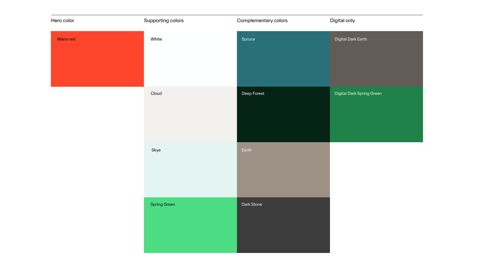
We use our hero color (Warm Red) and supporting color (Spruce) across most of our primary design applications. Our neutral colors help balance and support Warm Red, while complementary colors add depth and richness to the palette. Below are a few key rules to keep in mind when using our color palette.
Digital-only colors should not be used in print
We have two additional digital-only colors to support accessibility; these should not be used in print.
Always use color values as provided
Always use color values as provided; don’t rely on computer-generated eyedropper values.
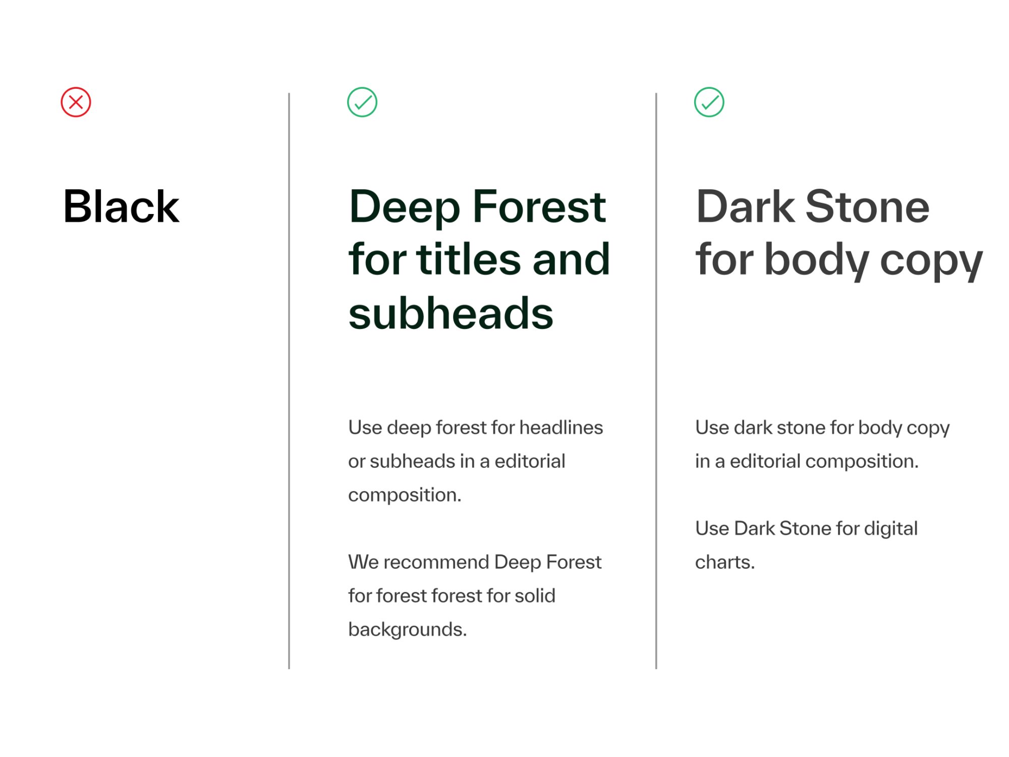
Avoid black for type
Our color palette, especially our core and secondary colors, reflects the energy and vitality of our brand. Avoid using black whenever possible as it does not complement our core color, Warm Red. Instead, use Deep Forest for headlines, subheadlines, and backgrounds, and Dark Stone for body copy and digital charts.
Formulas and color matching
At Kyndryl, we use custom CMYK formulas based on the GRACoL standard for coated printing. For uncoated printing or other special conditions, work with your vendor to find the best color match. Otherwise, always use the values provided below.

Primary
Warm Red
Pantone Warm Red C
CMYK: 0 / 83 / 81 / 0
RGB: 255 / 70 / 45
Hex #FF462D

Secondary
Spruce
Pantone 2223 C
CMYK: 84 / 20 / 22 / 22
RGB: 41 / 112 / 122
Hex #29707A

Tertiary
White
CMYK: 0 / 0 / 0 / 0
RGB: 255 / 255 / 255
Hex #FFFFFF

Tertiary
Cloud
Pantone 9103 C
CMYK: 10 / 5 / 10 / 0
RGB: 242 / 241 / 238
Hex #F2F1EE

Tertiary
Skye
Pantone 7457 C
CMYK: 25 / 0 / 0 / 0
RGB: 228 / 244 / 241
Hex #E4F4F1

Tertiary
Spring green
Pantone 2412 C
CMYK: 56 / 0 / 56 / 0
RGB: 76 / 221 / 132
Hex #4CDD84

Tertiary
Deep forest
Pantone 627 C
CMYK: 93 / 31 / 66 / 81
RGB: 4 / 35 / 21
Hex #042315

Tertiary
Earth
Pantone 402 C
CMYK: 34 / 30 / 33 / 8
RGB: 158 / 146 / 135
Hex #9E9287

Tertiary
Dark stone
Pantone 4287 C
CMYK: 66 / 62 / 55 / 54
RGB: 61 / 60 / 60
Hex #3D3C3C

Digital only
Digital dark earth
RGB: 86 / 80 / 73
Hex #565049

Digital only
Digital Dark Spring Green
RGB: 24 / 126 / 63
Hex #187E3F
Color matching
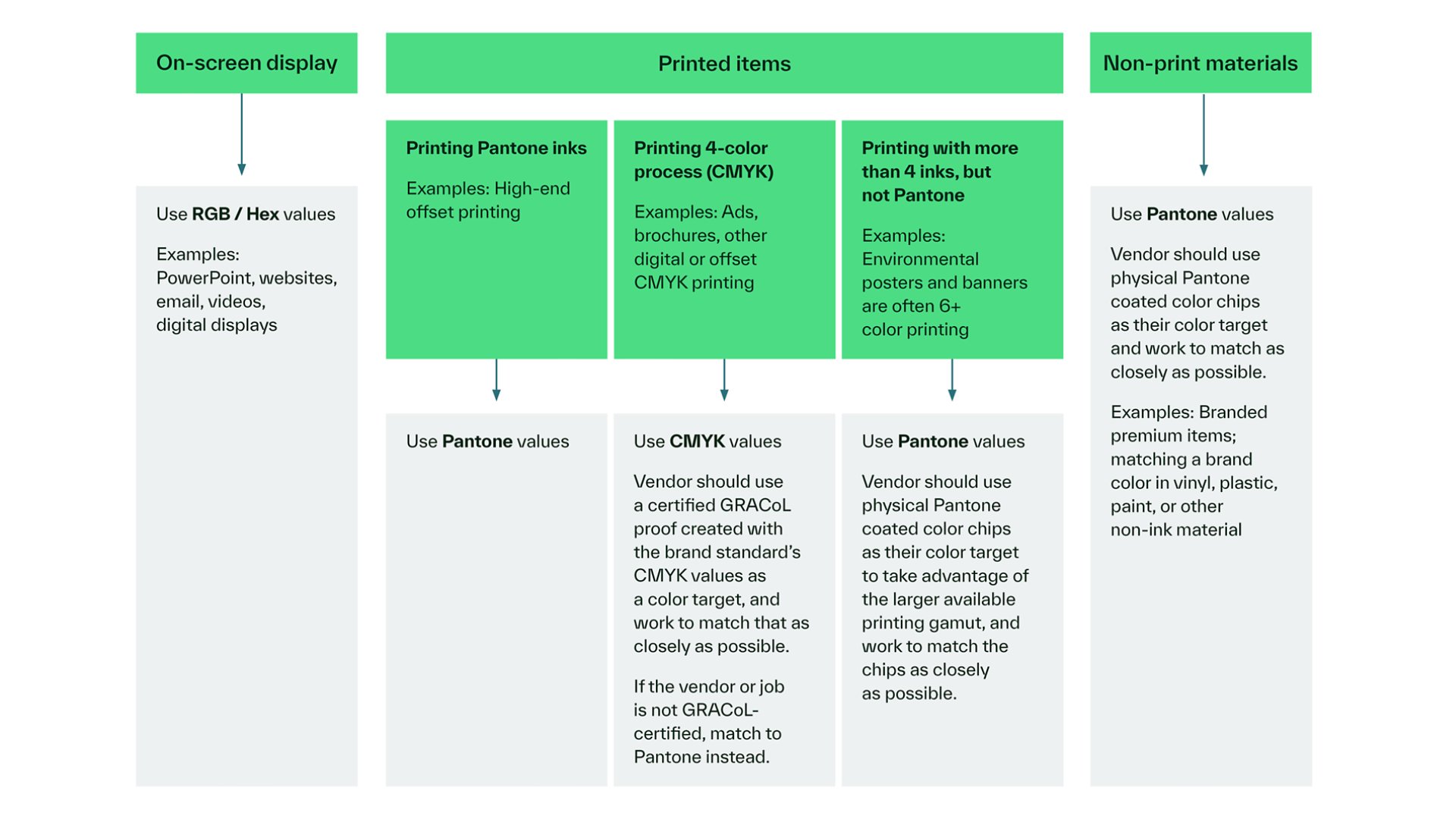
The table and directions below can help you quickly identify which color space to use and how to match colors depending on the material you are working with.
RGB:
Use RGB for all digital materials.
CMYK:
CMYK has a more limited color range, so it's best used for printing that relies only on cyan, magenta, yellow and black inks. When printing in CMYK, look for vendors that are GRACoL-certified, as GRACoL is an international standard that ensures color consistency.
Pantone:
When additional inks are available (such as for environmental graphics), setting up files using Pantone colors can help achieve a broader, more accurate color range — even if the final piece isn't printed with Pantone inks. This approach requires reviewing print proofs and color tests with your vendor to ensure accuracy. If that level of coordination isn't possible, use the approved CMYK formulas.
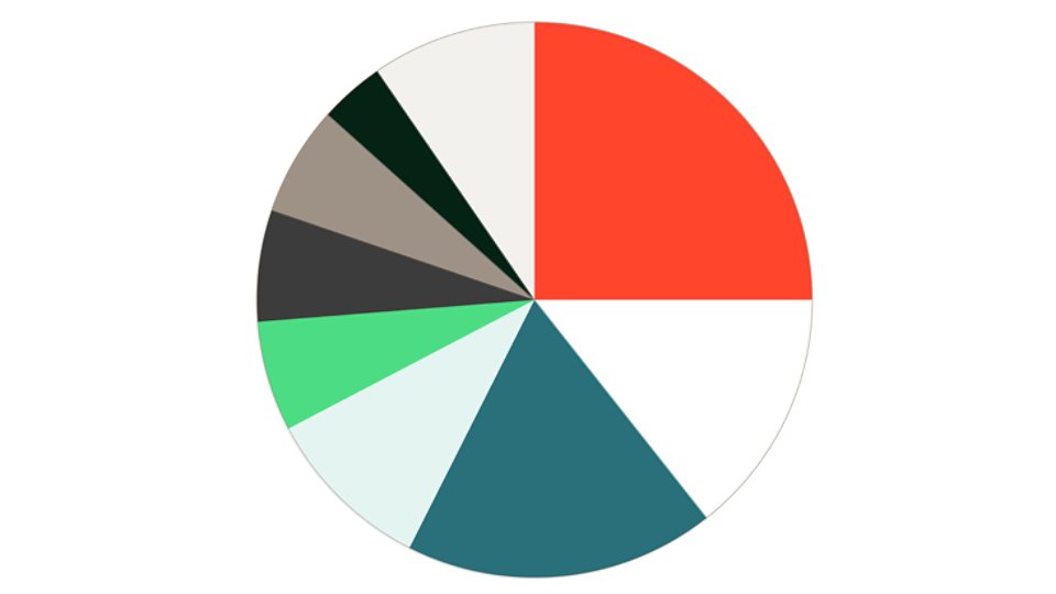
Recommended color proportions
Our recommended color proportions help to keep our color palette balanced and cohesive across branded assets.
Accessibility guidelines
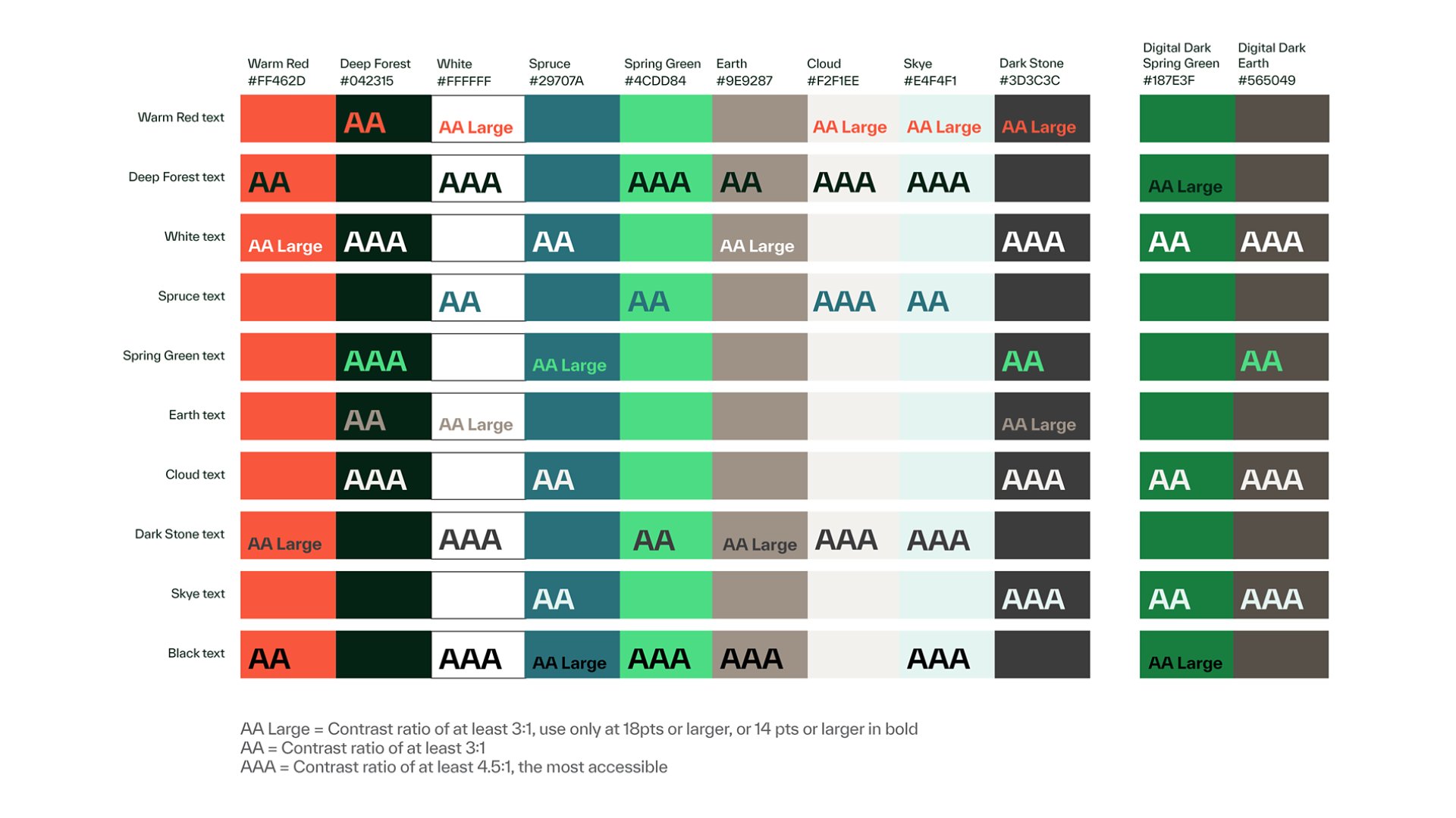
To keep our communications accessible and easy to read, we use high-contrast color combinations for text and backgrounds. Use the chart below to see which color combinations work well in all cases, which should be used selectively, and which to avoid.
01
The color combinations with an AAA rating are highly accessible.
02
The combinations rated “AA Large” can be used for larger text, but avoid using them for body copy.
03
If no rating is shown, the combination is not accessible and should be avoided.
04
Note: While black is provided as a text color option, black is not part of our brand color palette and should only be used for copy when necessary. It should never be used as a background color.
Reference the Web Content Accessibility Guidelines at w3.org for more detailed guidance on best practices for accessibility. The Adobe Color Contrast Analyzer Tool can be used to check color contrast for accessibility.
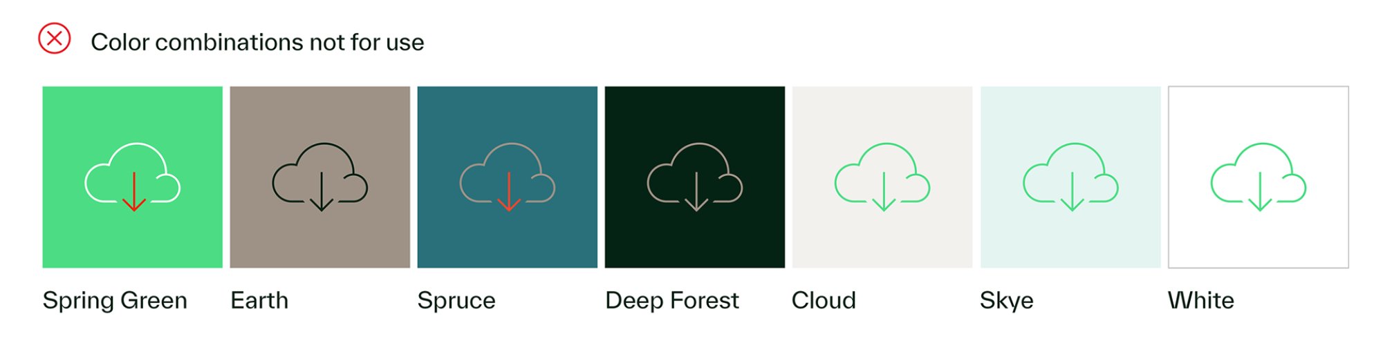
Color combinations to avoid
The color combinations below are not accessible and should be avoided.
Color misuse
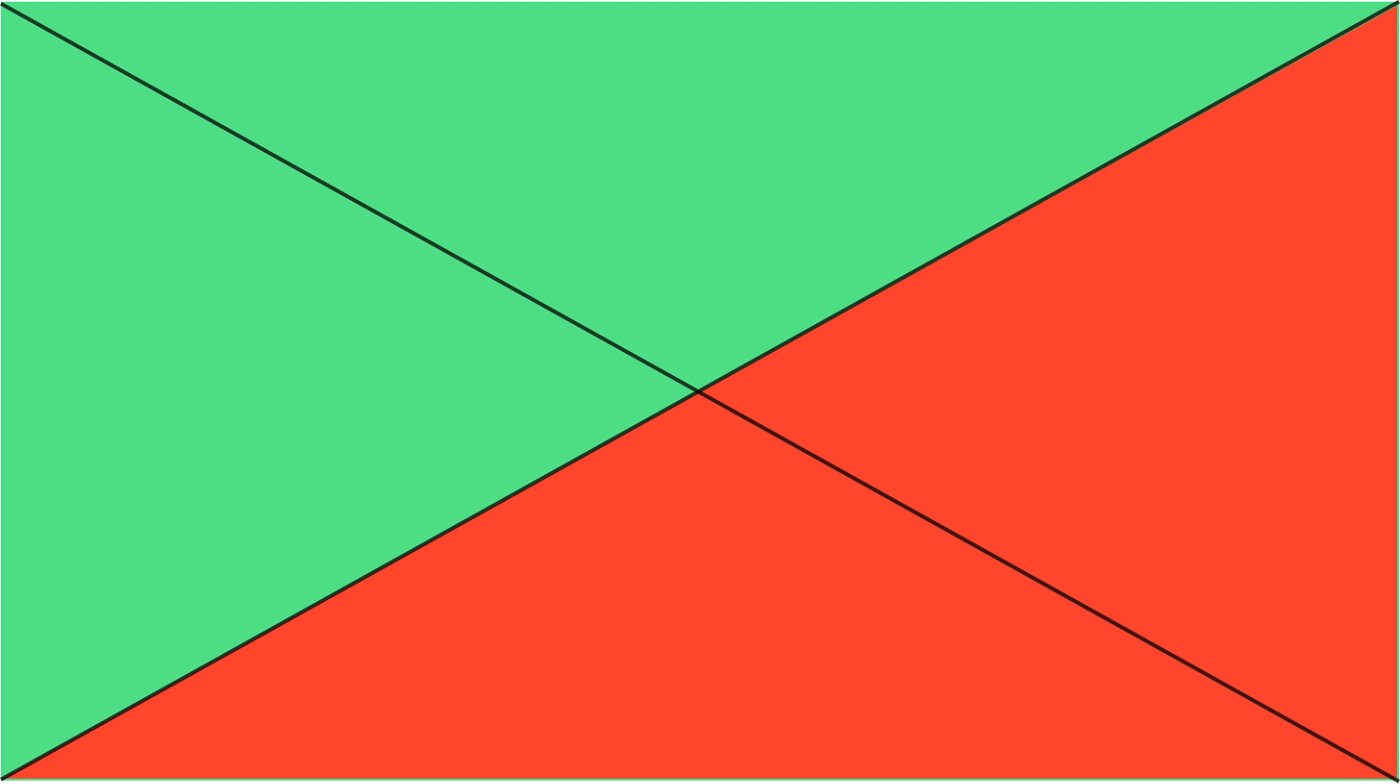
Avoid pairing Warm Red and Spring Green, as the combination can feel a bit too holiday-like.

Do not create gradients.
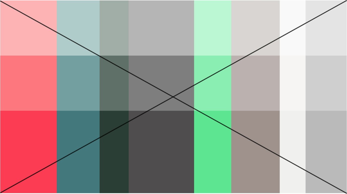
Do not use tints of our colors; always use the approved colors.
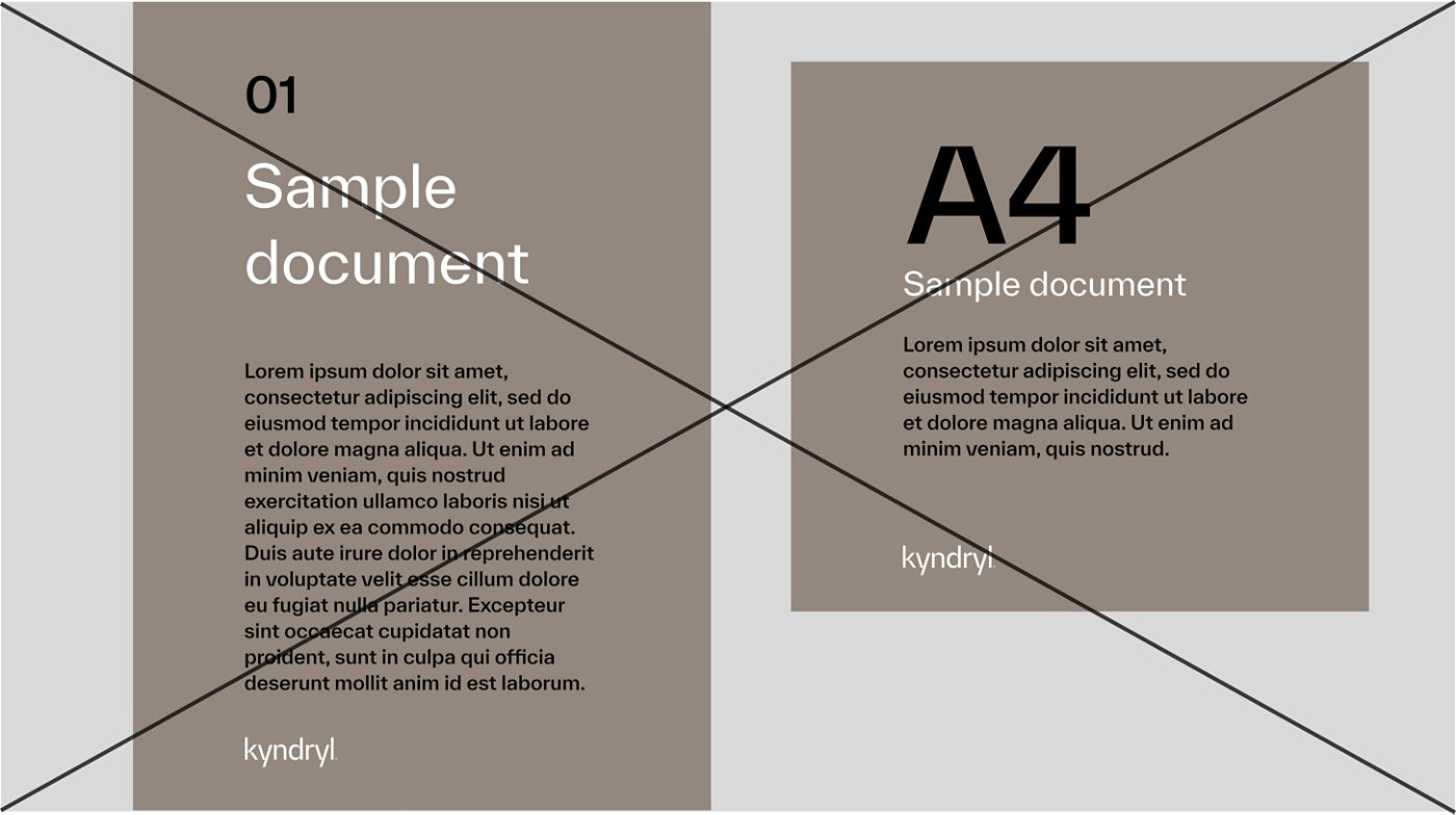
Do not use Earth in digital or print communications.

Do not use Warm Red to indicate errors, negative reactions or warnings.
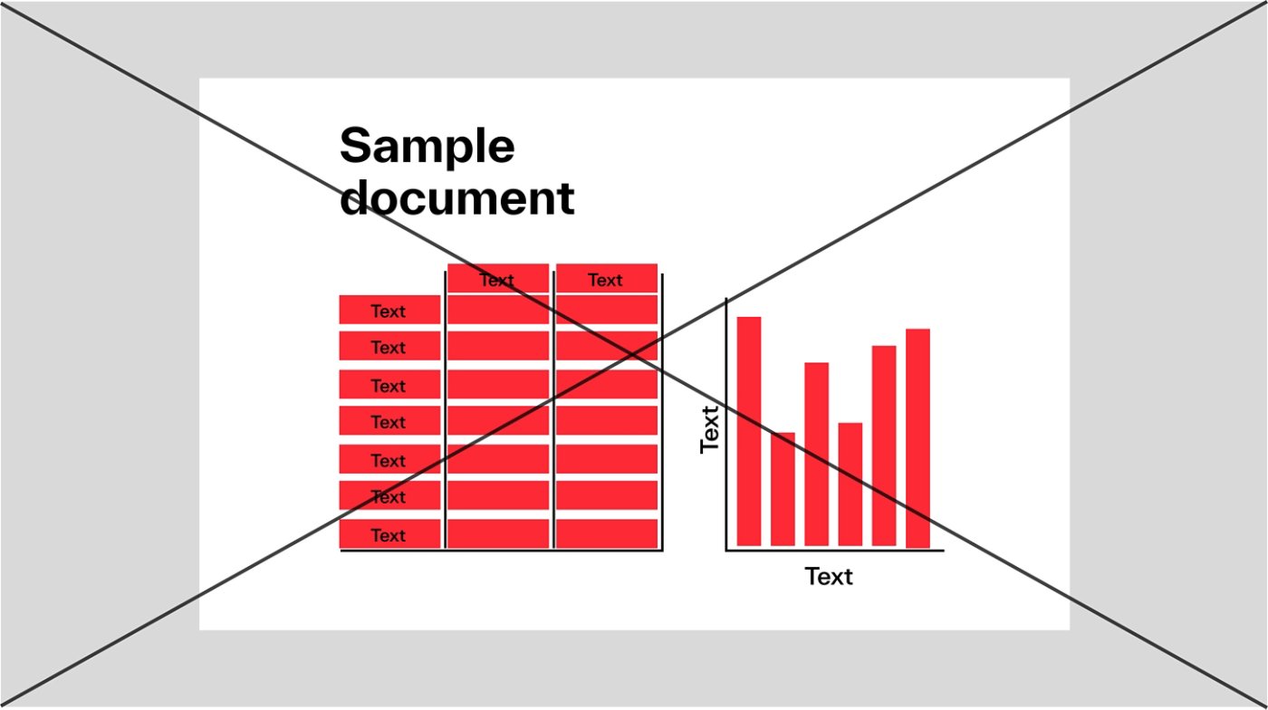
Do not overuse Warm Red in communications; always follow our color proportion guidance to ensure balance and consistency.
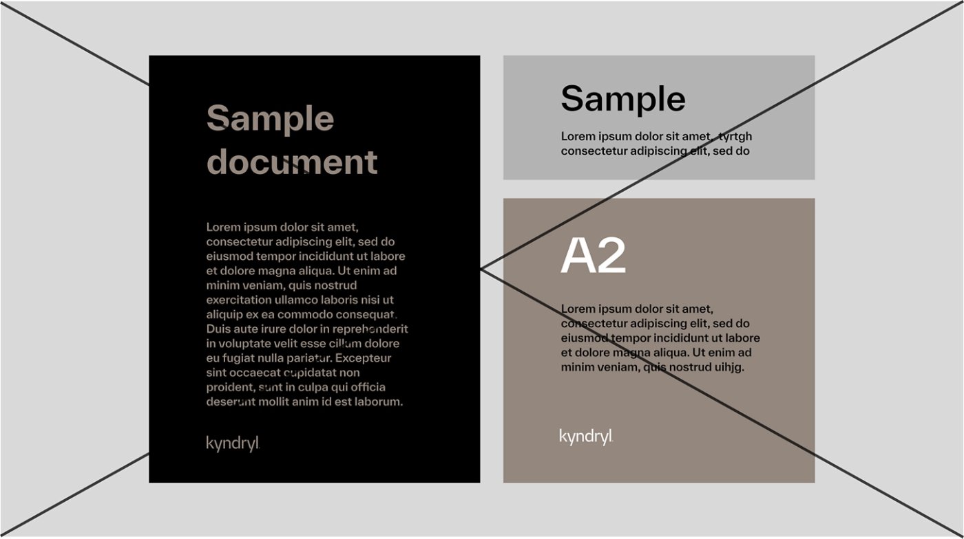
Do not overuse our neutral colors. Always use our color proportion guidance to ensure that branded assets feel balanced and consistent.
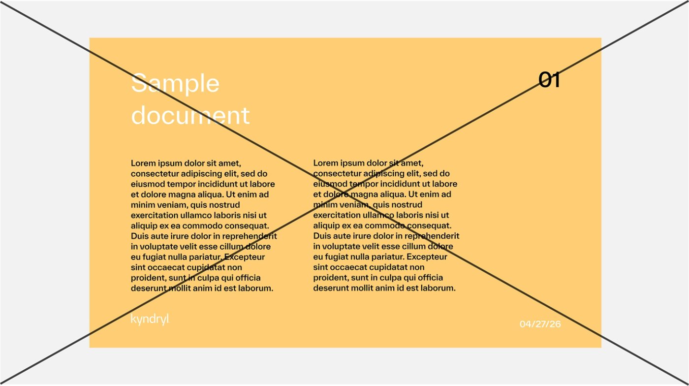
Do not use colors that are not in our color palette.
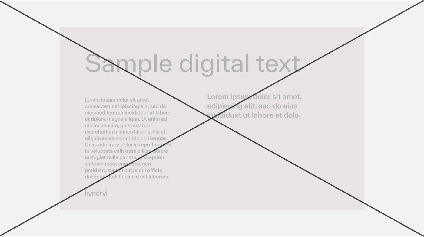
Do not use color combinations that are not accessible.
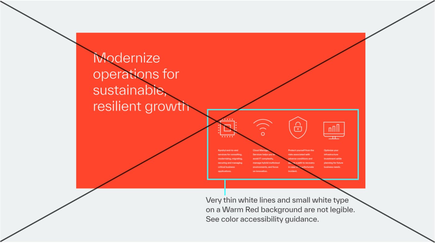
Do not use thin white lines or small white text on Warm Red. Check details about white text on Warm Red in the accessibility guidance above.

Do not place Spring Green elements on a white background and vice versa.